WC26, my World Cup tracker, had a perfectly serviceable knockout bracket: horizontal round columns on desktop, a vertical round-by-round stack on phones. Serviceable was the problem. I had a reference image I kept coming back to: a circular single-elimination fan chart with the trophy glowing at the centre, teams on concentric rings converging inward round by round, a curved coloured path per team, greyed placeholders for the ties not yet decided. I wanted the bracket page to be that, and I wanted that level of design to become the bar for the rest of the site.
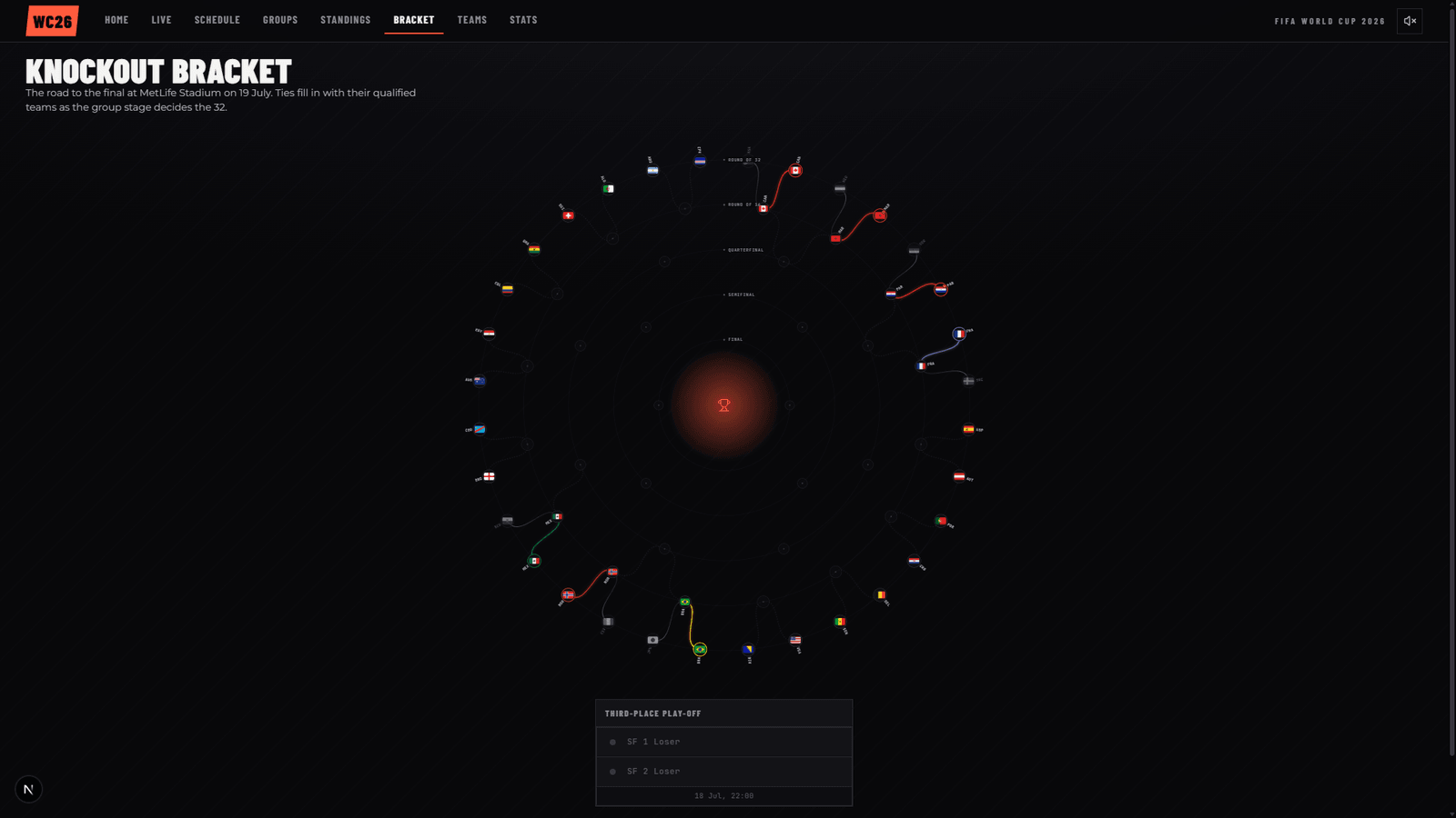
The result is RadialBracket.tsx, a desktop-only component that replaces the column bracket at wide widths (the mobile stack below that stayed untouched). Most of the interesting work was not visual at all.
First, know what round you're in
There is no bracket endpoint in the data feed. The bracket is derived from match data: who advanced, who won, shootout scores. The round detector was originally name-based, matching placeholder patterns in fixture names, and it worked right up until the draw put real teams into the knockout ties. A match between two real teams matches no placeholder pattern, so all 16 Round-of-32 ties and one Round-of-16 tie silently vanished and the bracket started at the Round of 16.
The fix, from late June, was to stop being clever: the feed's season.slug on each event is authoritative (round-of-32, round-of-16, quarterfinals, semifinals, 3rd-place-match, final), so detection now reads that, with the placeholder heuristic demoted to a fallback. The same pass surfaced the feed's outcome headline per tie ("Paraguay advance 4-3 on penalties"), because a shootout tie whose 90-minute score is a draw reads wrong without it.
The leaves are not in the order you think
Here is the trap in every naive bracket renderer. You place the 32 Round-of-32 slots around the outer ring in feed order and assume adjacent matches feed the same Round-of-16 tie: winners of match 1 and match 2 meet, winners of 3 and 4 meet, and so on inward. The real draw does not work that way. Checked against the live data: the Round-of-16 tie involving Canada and Morocco draws its teams from Round-of-32 match 1 and match 4. Not 1 and 2.
So the leaf ordering has to be earned, not assumed. Each slot in a round declares what fills it: either a decided winner, or the feed's own placeholder text ("R32 8 W", winner of Round-of-32 match 8). A recursive tree-walk follows those references down from the final, and the order the walk visits the leaves is the order they go around the ring. Every position on the outer ring is there because the tournament structure put it there, never because of a guessed pairing. Ties that exist but are undecided render as dashed grey. Slots that are eliminated or unknown draw nothing at all.
Two lines meet at a point
Each team's journey is a bezier path with crossed control points, so the two teams in a match visibly converge on a single point. Path colour is the team's stable brand colour from the feed, deliberately not the match-day jersey colour, which changes from match to match. A team's line should be recognisable as it advances. Where a primary is too dark to read (France's navy), it gets lightened toward white rather than swapped for an unrelated alternate colour.
The first version had a real bug that I only saw on review: you could not tell who a team had beaten to advance. The loser's path was suppressed outright:
if (state !== "winner" && state !== "pending") return null;
Geometrically, both slots of a match already share the exact same convergence point, so the fix was simply to draw the loser too, styled distinctly: thin, grey, no glow, opacity tapering toward the convergence point but never reaching zero there. An earlier attempt did let it fade fully out, which recreated the original problem at the exact pixel where it mattered. Now every decided match shows two lines meeting, bold and glowing for the team that advanced, thin and grey for the one whose run ended there. Verified against real results: Morocco over the Netherlands, Brazil over Japan, Mexico over Ecuador.
Two structural exceptions. The third-place playoff forks off the semi-final losers, so it does not fit the two-converge-to-one pattern; it lives in a small side card instead of distorting the fan. And shootout ties get a small "P" badge, with the full compact shootout strip inside the click tooltip, verified on both real shootouts so far (Germany-Paraguay 4-3, Morocco-Netherlands 3-2).
A circle on a short laptop
A radial chart wants a square. The square's box had a 1:1 aspect ratio scaled to available width, with no relationship to viewport height, so short-but-wide laptop screens (1440x800 and friends) forced a page scroll. The fix is a useLayoutEffect with a ResizeObserver and matchMedia that measures the real heights of the nav and footer, then sizes the square to min(availableWidth, availableHeight). Zero-scroll verified at 1920x1080, 1600x900, 1440x800, 1280x1024, 1200x1400, 2560x1200 and 2560x1440. There is one honest floor: at 1280x720 the chart hits its 380px legibility minimum and the page scrolls 44px rather than clipping or overlapping.
The flags got the same treatment as the geometry: no faking it. The crests were rectangular flag images with clip-path: circle(50%) slapped on, cropping awkwardly. I swapped the bracket to the MIT-licensed circle-flags set (HatScripts), purpose-built round flags, backed by a new complete ISO 3166-1 alpha-2 mapping for all 48 qualified teams, checked against the live teams API. England and Scotland correctly get their dedicated gb-eng and gb-sct flags, not a generic gb. Scoped to the radial bracket only; the shared crest component used across nine other surfaces is a future pass, not a casualty of this one.
The regression the build report didn't catch
Much of the implementation here was done by an AI build agent, and its report was clean: typecheck, production build, screenshots compared against the reference. My own verification pass found something the report did not. The whole <svg> carried role="img".
Per ARIA semantics, role="img" collapses everything inside the element into one opaque, non-traversable image for screen readers and keyboard navigation. The cruel part is that each of the 62 match nodes underneath was already individually marked up properly, role="button" with tabIndex and an aria-label. Good work, silently defeated by one attribute on the parent.
The fix was to remove role="img" from the <svg> (keeping its aria-label as a group label) and to add the onKeyDown, onFocus and onBlur handlers a custom button role requires. A real <button> gets Enter and Space activation for free; a <g role="button"> gets nothing unless you wire it. Verified after: 39+ focusable nodes reachable via Tab, focus landing on a correctly labelled node ("South Africa - Round of 32"), Enter opening the tooltip, and a screenshot confirming zero visual change.
The bracket survived into the site's later full v2 rebuild largely intact, with two footnotes from my build records: v2's flatter design language traded the champion's soft glow for a flat disc with a hard ring, and the one-screen fit broke once, because it was measuring a nav element v2 had deleted. Measuring live chrome by class name is a promise the rest of the codebase does not know it made. That one now measures the chrome that actually exists.